It's a moment I've long been waiting for. Ever since we began our quick kitchen makeover earlier this summer, I've been excited for the day that I could accessorize the new shelves we planned to build above the wine bar. Now that the shelves have been built, painted and hung, my moment had arrived.
First I needed to address the issue of covering up the outlet, cords, and transformer that sit above the lower shelf. I contemplated a few ideas on how to best camouflage this area and decided that using a frame to cover up the outlets, cords, and transformer was the route to go. As luck would have it, last month when we were on vacation in Prague (we're still working on the overall Prague wrap-up post), I bought a print on the Charles Bridge from a local artist.
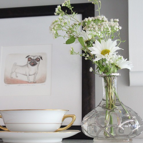
Although the artist was selling a wide array of art, I passed up the sketches of local Czech landmarks in favor of a whimsical animal print. The piece I decided on features a drawing of a bug eyed pug, basking in all his ugliness. (I know, I'm a sucker for all things pug, so I can't say I'm surprised that this was the winner.)
I hadn't yet framed the piece, so over the weekend I picked up an off the shelf frame and mat for less than $15 at my local craft store, cleaned the glass inside and out, and put my pug print in his new home. The frame style isn't my first choice, but it was an inexpensive solution to an immediate need. (You'll see my new pug friend in a minute.)
The next morning, having my framed pug print in hand, I set out to style our three new shelves using only items we already owned. First I accumulated items from around the house that I thought I might want to use, such as cake plates, white serving dishes, and other decorative accessories.
When styling bookshelves, there are a few rules I live by:
Odd Man Out
A basic design principle tells us that items grouped in odd numbers are more pleasing to the eye than those grouped in even numbers. I try to follow this rule whenever possible, by grouping odd numbers of items or accessories together, usually in groups of three.
Stagger Heights and Textures
Another way to add visual interest to a display is to use varying heights and textures. In this case, I've mixed glass, metal, ceramic, and natural elements in varying shapes, sizes, and colors.
Leave Room to Breathe
In an effort to avoid a cluttered feeling, I try to maintain open space on each of the shelves. This breathing room gives your eye a place to rest, and keeps me from getting that feeling that I'm watching an episode of Hoarders.
Make it Personal
There's nothing worse than walking into a home that feels like it was purchased straight out of a catalog. I want our home to tell a story, in fact, to tell our story of who we are, where we've been, and what or whom we love. Incorporating items from a treasured vacation or a beloved family member are just a small daily reminder of the important things in life. This pig creamer, for example, belonged to my grandmother, and makes me smile each time I look at it.
Ensure Balance
One thing I always keep in mind is the visual weight of the items on the shelves. I work to balance the size and weight of items throughout the shelves and typically stagger the location of the visually "heavy" items so they alternate sides on the shelf. This is seen by the alternating location of the soup tureen and cake plates on the kitchen shelves, as well as the darker colored accessories.
Repeat, Repeat, Repeat
Design should be interesting and unique, but one thing that makes them "work" is repeating like objects or colors. This repetition prevents the look from becoming too chaotic and cluttered. In the case of these shelves, I repeated the use of white kitchenware as well as gold and silver accents.
Here's a look back to what the wine bar looked like before we installed the shelves.
And here's a look at the finished result.
The shelves not only create the balance that we needed next to the window, but also give us added storage and display space. And doesn't the pug print do a great job of concealing the ugly electrical "stuff" on the lower shelf?
I look forward to tweaking this space as the seasons (or my moods) change, incorporating seasonal items or new meaningful treasures. Hmm, maybe this is the new home for Alex's nutcracker collection at Christmas? The thing that excites me most is that the possibilities are endless and will almost always look good if I stick to the rules that I've outlined.
Do you have any tried and true design rules that you like to stick to? Are any of your rules of thumb similar to mine? Or perhaps your approach goes directly against some of the things I've outlined? Let me know, I always like to hear how other people tackle similar challenges.

![]()
![]()