After two full years, we're ready for our living room's grand reveal!
That's right! We've been slowly working on this project since early 2015 and can finally say we're done! (Well, okay, 98% done.) But more importantly, we can also say we absolutely love it!
I mean, just look at the before from the very same angle!!
What a difference!
Over the last several weeks we've been sharing the major progress we've made when it comes to those final punch list items. All the while we've been loading in the furniture and decor that we've been patiently waiting to put to use. But this doesn't mean we haven't been sneaking peeks along the way.
Way back in late 2015, after the floors had been refinished but before we started work on the plaster, we actually moved the couch and rug we'd purchased into the shell of the living room to get a sense for how the space may end up looking.
Like any good long running project, we've both had a vision all along, and that little glimpse was just enough to confirm that we seemed to be headed in the right direction. And it was also a sufficient test to tell us that the small gray chairs we'd picked up for either side of the fireplace were going to be way too small. We knew it right away. Heck, Lulu even knew it right away.
Since that early test we kept working away on the room as well as several other projects. In that time we trudged ahead in the living room, we also finished the small downstairs bathroom and office, worked on many outdoor projects, and even started the hallway. But all of our work in the living room finally came to a head after we wrapped up painting and were able to move things into the room for real.
In these photos you'll notice that the fireplace mantel was a work in progress while we were getting the room ready. This was the plan all along and it was primarily because we really just couldn't wait any longer to start using the room.
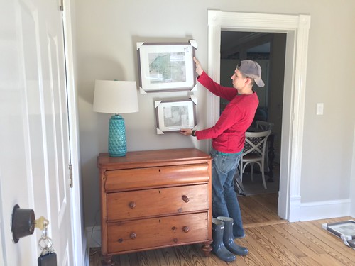
On the day we finished painting I could not wait to start loading things into place. The faint smell of freshly dried paint hung in the air as we started moving in the first of the furniture destined for the room's "entry" area.

The fact we have an "entry" area in this room is one of the interesting things about this room, simply because the dimensions of the room feel pretty massive. At 13 feet wide and over 30 feet long, it's the single largest room I've ever had the pleasure of decorating. But it also means that it can't really be treated as one room. Here's a reminder of my plan for this room.
As I mentioned in my room design post, we're actually treating this as three separate spaces. After the room's "entry," we have the main central living space, and then the reading nook with views out over the water. All of this space meant that I'd need my fair share of decor and accessories, a small hoard I'd been collecting over time.
On the side opposite of the pine dresser, I placed a large plant in a natural basket and a large lantern that was a gift from my aunt. It certainly softened the space quite nicely. In truth, I really wanted a fiddle leaf fig for this corner, but after pricing them out (at almost $200 for a large one!), I decided that this $17 palm was a much better fit for my budget and my black thumb.
We also have two windows in the room on either side of the fireplace, and I wanted to layer my window treatments since they're south facing and get a lot of sunlight throughout the day. Here we used some lined bamboo roman shade blinds hung in each window.
The blinds I chose are one of the new offerings at Lowe's where you can have them custom cut to size right there in the store. I purchased the box, we made sure they looked good by holding them in the windows, then we packaged them back up exactly how they'd been packed before and took them back to the store to be cut. This is the first time I've used this service, and I must say, it was pretty cool how it works. We specified the measurements and the clerk in Lowe's put the whole box into a cutting drawer.
The machine then moved the box to the right locations based on our measurements, and a small circular saw made several small passes, cutting the ends of the box off and making the blinds exactly the size we needed.
It was a great way to get an inexpensive but still custom sized set of lined bamboo blinds.
To add an additional layer of softness to the windows I opted to hang inexpensive white IKEA panels on black target curtain rods. This gave the windows a layered look and added a good amount of texture in the room.
The day we were loading in the furniture was simply beautiful when it came to the weather, and we absolutely made the most of it.
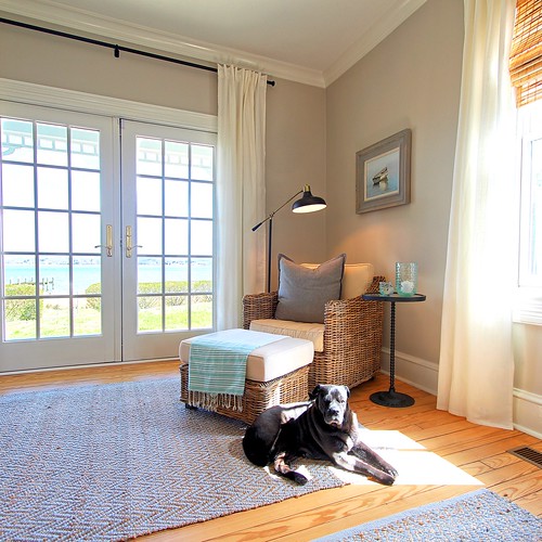
The area near the French doors is a nice spot for a reading nook, so we placed a large chair and ottoman from Ballard Designs, a floor lamp from Target, and a cute side table from the Pottery Barn Outlet.
I hung a beautiful original painting in a lovely grey frame from HomeGoods of all places (who knew they sell original art?), and just love how it looks hanging above the chair on the wall.
Everything about this room feels so wonderfully calming. We used a few of our own photos from around the house printed in black and white, hung in pre-matted frames also from HomeGoods.
This is one of the most fulfilling projects we've ever completed. Everything looks just how we'd hoped back when we decided to remove the dividing wall from the room.
The openness of the room and natural light it receives, along with the views of the water, make it such a wonderfully peaceful setting. We also decided to replace the existing ceiling fan in this room with one that would better blend into the white ceiling. We looked for months to find the right one, and finally landed on this one from Hayneedle. We purchased an outdoor dining set from this site a few years back, and were really happy with their prices and quality of their merchandise. This fan is no exception. It's one of least offensive looking fans I've ever seen (I think we can all agree that ceiling fans aren't ever the design star in a room's design), and the color is a perfect match for the room.
The center sitting area against the shiplap behind the couch feels perfectly suited for the room. Just to the side of the couch is a marble topped antique table with cast iron base, a beautiful gift from a client of mine given to me when her Dad was downsizing.
Behind the couch, the shiplap addition to disguise the support posts was the perfect decision for the room. Not only does it do a good job of covering an undesirable aspect of the room, it also breaks up what would otherwise be an expanse of grey wall.
I found the calming print hung above the couch at HomeGoods, and the antique trunk was a gift from Alex's parents. Alex grew up with that trunk in their living room, and when they recently redecorated this room, they were no longer using it, so we jumped at the chance to add it to our house.
The fireplace looks wonderfully at home in this room now that the mantel is a better size for the room. We're still shopping for the right chairs for either side of the fireplace (the reason the room is only 98% done), but we're not in a rush. We already purchased the wrong pair on final sale, so we've decided to take our time to ensure the next purchase is the right one for the space.
As you can probably tell from my description, we're very excited with how this turned out, and we absolutely can't wait to go back to the house and enjoy the room each weekend.
This project has energized us for the work we'll be tackling this summer. We need to be sure to make time to relax and enjoy the home in addition to charging ahead with projects, but this is just the burst we need keep moving to transform the whole house into a relaxing getaway on the water!
If you want to get caught up on our past living room posts to understand how we got to where we are today, here's the whole list.

![]()
![]()