We're debating what our fireplace mantel should look like, and we'd love to hear your thoughts.

Since we bought the house and started working on the living room project last October, we knew we'd be making some pretty significant changes to the fireplace mantel. The mantel that was there when we purchased the house seemed fine at first glance, but when we really started looking at it we realized it was a slightly odd looking and somewhat out of place mantel that was put in around 1992.

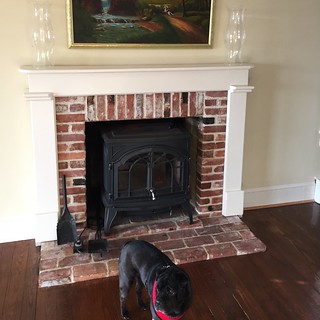
It didn't mesh with the rest of the house, seemed to be somewhat shoddily built, and actually fell right off of the wall when I applied a little pressure with the pry bar. When I saw the back of it, I could tell it wasn't really meant for our house, and in a way, I was freeing it to go run and play with its friends in a field somewhere.

Now that we've made our choice to build a custom mantel rather than trying to find a salvaged mantel for the space, and we've made the choice to do our own version of shiplap above the mantel, we need to actually figure out how the new custom mantel should really look.

We've been researching and pinning different styles of mantels in homes of a similar age to ours (~1908), and we've amassed quite the collection of examples. Many are far too ornate, too decorative, too standard, etc, but a handful feel like they might be the right ones. Take a look at some of these selections and we'd love to hear what you think will or won't work well in our home. 

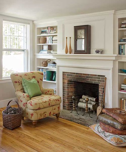
Photo Credit: This Old House

This first mantel has a similar feel to our firebox with the brick surround and the panelling above, but the age of the home (an 1850 farmhouse) certainly puts the mantel in a much older category. I definitely like the relative simplicity of the design, and there may be elements we can borrow, but it does feel like it won't really fit in our room.
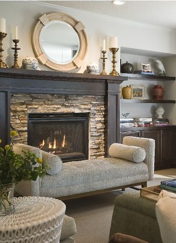
Photo Credit: HGTV

This mantel may not look at all like our home, and we'll almost certainly be painting ours white to match the trim, but there are millwork details about this option that I really like. The paneled sides, the change in depth, and the thickness of the mantel really seem like it would work well with the room.

Photo Credit: Old House Dreams

This Mantel from a 1906 Foursquare is a more traditional mantel you may have seen in a home similar to our home's age and style, especially that our home has several more traditional Victorian elements, like it's cause between two design periods. However, the Intricacies of the supports and styles are likely just too much for our home.

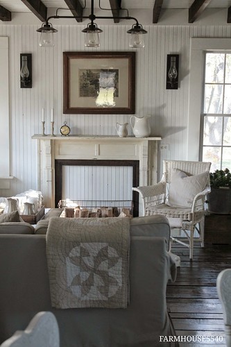
Photo Credit: Farmhouse5540

This mantel shows a very simplified look of a farmhouse mantel. More delicate details, breadboard wall, small panels, and detailed millwork on the sides. This may be closest to what would have been in the house, and there may be elements of it we can use, but the mass of the shiplap wall and large room would likely overwhelm something small like this. I like it a lot, but probably not for our room.

Photo Credit: Arts & Crafts Home

Okay, so I really love many details of this fireplace. The use of the paneled sides, the mild use of moulding (like base cap) as detail accents, and the large plain facia piece. With modifications I think a lot of this would work really well in our room, such as larger wrap around side columns rather than smaller ones like the photo. This is a real contender in my book. Wendy feels it's too fussy and formal for the look we're going for in the room, especially under the simple ship lap.

Photo Credit: Old House Dreams

Now this mantel may be extremely close to what we're looking for. It's in a 1910 Portland Bungalow and really has a lot of similarities to our home. The panels above, the overall simplicity, and the general look is what Wendy has been envisioning. I feel like may be a little too plain and simple for our room, and I wouldn't mind adding a little panel detail to the two columns, but it definitely is more or less the size and scale we're interested in.

So, what do you think about all of the ideas we're proposing. Any favorites, additions, ideas? We'd love to hear your thoughts as we're stuck in a bit of a stalemate. 

Comments 35

Comments

Whitney Kerr
9/1/2015 at 12:57 PM

My favourite by far is the old house dreams one. But I'm not sure how well it would work with the boards above...?

Natalie
9/1/2015 at 1:23 PM

I think if you are going to have the shiplap above, you should go with the last picture (Old House Dreams). As much as I love paneling on mantles (HGTV pic), I think it would compete with the shiplap and texture of the brick, and be too busy. Good luck!!!

Sandi
9/1/2015 at 1:32 PM

I like the last one, but feel that the proportions need a little "slimming" out to fit with your house (less arts and crafts, more colonial). The simplicity of the design goes really nicely with the paneling detail above.

Lori
9/1/2015 at 1:59 PM

Definitely the last one! I feel like with the shiplap plus the brick, going too ornate with the mantel detailing would be a little too busy.

Kay
9/1/2015 at 2:22 PM

I'd say the last one. If you think it's too plain, maybe a small trim, like on the rest of the wood in the foto but small and shallow. Like 1" wide and 1/2" thick (max). And only on the side, across the top it might be too busy with the shiplap. Nothing bulky, just to add a little visual interest.

Miriam
9/1/2015 at 2:49 PM

I really like the substantial one off HGTV. I think it would be fun to work in the original moulding profiles from the house into the mantle too! The last photo has some great components (the shiplap! the simple form!) but feels a little lacking in fun cuts, and the mantle feels skimpy in comparison to the rest of the details in the room. The shiplap becomes the focal point instead of a component.

Kelly Lang
9/1/2015 at 4:09 PM

Definitely the last one, given the wall above it.

Nicole
9/1/2015 at 4:33 PM

Combine the HGTV mantle and the Old House Dreams ones - maintain the simplicity while adding side panels and depth change. The shiplap in the Old House Dreams photo differs from your in that it's not framed on the sides, so maybe adding the side panel details on the mantel could tie together the top and bottom features of the fireplace wall? So - simple, but with a presence. Or something like that.

Gaidig
9/13/2015 at 4:49 PM

I completely agree - a depth change as in the HGTV one would give the Old House Dreams mantel more presence to hold up to the ship lap. (In the Old House Dreams picture, I think the mantel is overpowered by the shiplap, and I think you want to emphasize the mantel.) I like the paneled columns, but I do think they may not be right for going with the ship lap. However, if you made the panels more shaker-style, that might work nicely.

LD
9/1/2015 at 5:56 PM

Bottom pic with HGTV mantle!!

Kerrie
9/1/2015 at 6:17 PM

I'm a bit with the other comments in wondering about the combination of the brickwork and shiplap with a formal mantle. I wonder if the top of the mantel would look any good with a thick, beautiful, rustic piece of wood rather than a more formal milled piece - may be too many elements tho. Did you see how Littlegreennotebook put her mantel together in their current house? She used different shapes to build up the profile. Even if you don't do your mantel the same way it may be a way to get an idea of shapes and proportions for your space

DAF
9/1/2015 at 7:08 PM

The last one for sure. It is easy to look just at the details without thinking of the mantel within the context of the wall and the whole room. I think it looks bare in the pic simply because there isn't any furniture. Once everything is in place and decorated, you'll appreciate the simplicity.

marc
9/1/2015 at 8:01 PM

I'm with the others... definitely the last one should be your main inspiration. I was originally thinking a hybrid of the Old House Dreams and the HGTV one, but extra details like paneling being a little busy with the brick and shiplap is a valid point. At the same time, you want the bottom half to have enough visual weight to balance out the ship lap above. Maybe a cardboard mock-up is in order?

9/1/2015 at 8:37 PM

I like the last one a lot, but I agree it is too plain. I vote for the one above it with the use of moulding and the plain facia. There's something a bit grand about it that will make your fireplace a focal point, yet the style is clean and simple.

Nice!

Can't wait to see what you do with it.

Claire
9/1/2015 at 9:26 PM

Have to agree with Wendy... That second to last one (while beautiful!) is just too fussy. The last one almost feels TOO simple; I like the horizontal parts but think the 'legs' could benefit from raised paneling similar to #2.

bfish
9/1/2015 at 11:07 PM

I'll be blunt -- as I read through and looked at the choices, it was so obvious where it was going. Alex wants to do a bunch of fancy woodworking because that's a great love of his. And Alex, you do beautiful work and many/most times I agree with your picks. But this is one time Wendy is 100% right -- or maybe it's 1000%. Listen to her and save the elaborate woodworking projects for your bathroom in Alexandria! (All this is offered with love, of course, from a long-time follower).

I know about this from long experience -- my husband is a very artistic and talented guy, both with design and build. But when it comes to fireplace surrounds he always wants to gild the lily. Resist that impulse!

Heather
9/2/2015 at 12:50 AM

Number 1 does it for me - by This Old House. Neat, simple, with clean, elegant lines. Purrfect, imho! :D

Heather
9/2/2015 at 10:29 AM

Number 1 does it for me - by This Old House. Neat, simple, with clean, elegant lines. Purrfect, imho! :D

Jan
9/2/2015 at 3:15 PM

Well, our house is from 1965, but we have the brick surround and dark wood paneling, and the mantel is an unfinished hunk of some kind of gray stone, slapped right on top of the brick. In case you're looking for other options, a hunk of stone might work in there maybe. Otherwise, I vote for the last one ... nice and simple and Alex might actually finish it before he retires, lol.

Ursula
9/2/2015 at 4:37 PM

I like the second one, if you paint it white, and the last one. Good luck!

Melissa @ HOUSEography
9/2/2015 at 10:23 PM

i think 1 and 6 are really simple except for the sides, so I think those are the best inspirations for your fireplace. Good luck!

Steve
9/2/2015 at 10:58 PM

I guess I'm in the minority, but I think the last one is way too plain. It's not that much different than what you're replacing. I like number 4, because it has a more Victorian feel and your interior details seem quite Victorian. Could you maybe design a more beefed up version?

9/3/2015 at 6:47 AM

Hi Alex, The design of old house dream is awesome and I appreciate the work.Alt smileAlt smileAlt smile

Rebecca
9/3/2015 at 10:07 AM

I like the HGTV one best if it is white, but the last one is nice as well, as long as it isn't too chunky.

threadbndr
9/3/2015 at 3:08 PM

I like the last one with two changes - a thicker and deeper actual mantelpiece shelf (you have to give Wendy somewhere to put vignettes LOL). I think it also needs just a bit of detailing on the sides, something that echoes the shape of other millwork in the room.

9/4/2015 at 1:53 PM

The one that I would vote for would be the next to last one, photo credit Arts and Crafts Home. The last one is too plain and it might become boring or overwhelming in time, whereas the other one has texture and interest.

9/6/2015 at 2:42 AM

I also like the last one but the fourth picture (this old house) is not bad as I kind of like a classic traditional style too.

9/8/2015 at 8:30 AM

I love this discussion so much. I get some inspiration from here.. Thanks for sharing this!

Katie
9/8/2015 at 11:42 PM

I love the last one and the HGTV millwork. Maybe something simple and straight with some interesting tile to add some subtle interest and color? The tile could be to period or add a more modern touch!cant wait to see what you guys decide!

9/10/2015 at 10:12 PM

The HGTV one is more period accurate for 1900's.. space above fireplaces wasn't framed in around that time unless you were in France - most folks just didn't have the $ to have that done, and even those that did have $, opted for the "low and long" look being ushered in by the 1920s...
(I've spent days at the libraries looking over this stuff because I'm re-doing my fireplace as well!)

9/14/2015 at 4:14 AM

Hey guys, Love what you are doing with the house. Check out my blog for my fire place surround ideas. http://www.dadmade.wordpress.com

11/11/2015 at 2:21 PM

I really like the arts & craft home for the same reasons you gave - I think a room should have a focal point and it should be the fireplace. Good luck!

Debra Gray Cripps
5/19/2016 at 10:02 PM
The last one!
Our Build
5/19/2016 at 10:02 PM
Wow, to many choices, good luck with it!
Jean-Christian Pitre
5/19/2016 at 10:02 PM
I'm e-mailing a detailed comment/reply along with dozens of photos.
Since you've not signed in yet, you will need to fill in your name and email below. If you have a Facebook account, save yourself a step and use Connect to login.

Denotes a required field.

Please enter full URL, including http://

You can use Markdown syntax in your comment. And you can also use lots of Emoji!
  • Search

  • Login
  • Follow
  • Advertising

If you're looking for information on advertising and sponsorships, head on over to our sponsorships page. You can purchase site sponsorships in a few easy clicks. 

Toolbox Tuesday
Open Housing
  • We're Featured!

Old Town Home has been featured in the following places and publications:

The Washington Post
 
Washingtonian Magazine
 
Domino
 
Old House Journal
 
 
Apartment Therapy House Tour
 
Washington Post Express Feature
 
Home & Garden Blogs
 
© 2024 OldTownHome.com. - Privacy Policy
Login Below
or
Sign in with Facebook
Connect

Unexpected Error

Your submission caused an unexpected error. You can try your request again, but if you continue to experience problems, please contact the administrator.

Working...

Working...