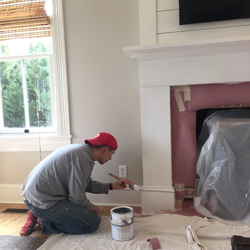
Over a year and a half ago, way back on September 1, 2015, we asked a question in a blog post. We had a mantel we'd need to build any day, and we needed to make a determination on just how that mantel in our living room should look.
Well, we've been slowly working on this living room project and have finally reached a point where that day has arrived.
Before we get into details, let's recap (in case you don't remember our blog post from a year and a half ago). The original mantel in the room was a poorly made pre-fab mantel from the early 90s. Too small for the room and fireplace, and just not all that attractive. It had an odd style, rounded corners, and just didn't fit with the style and age of the house.
While it looked just fine at first glance, that old mantel essentially fell off the wall because I looked at it sideways. In other words, it really wasn't installed very well, which made it rather easy to remove.
 Continue Reading Full Post
Now that the two and a half year long renovation of our new home's living room is nearing completion, it's finally time to launch into the decorating phase. And while the thought of that excites me to no end, it's also somewhat terrifying.
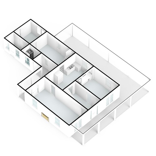
It's at this critical stage where I can't help but have nagging concerns. What if I make a costly mistake? What if we start purchasing furniture and accessories that don't work together or don't achieve the look we're going for in our home? How do I even begin to tackle decorating a room that's roughly 13 feet wide by 32 feet long?? For reference, this room is nearly as wide as our entire home in Old Town and almost half our home's length!(Here's a look at the home's full floor plan.)
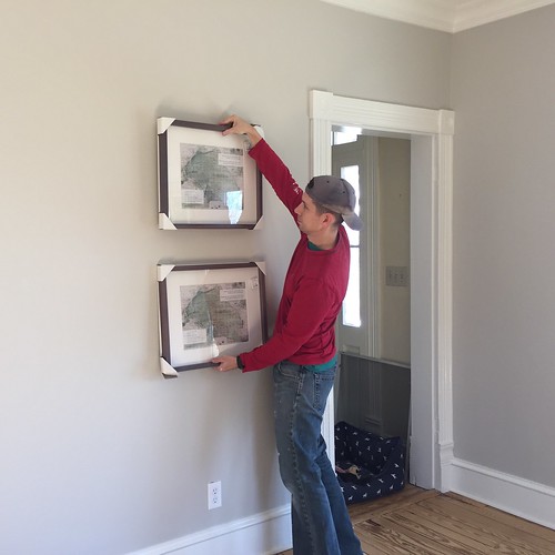
Getting started always seems like the toughest part. But luckily I've had quite some time to obsess think about it and plan for this phase of the renovation. So where did I start? With a floor plan, of course, as having a well defined but flexible plan provides me with a roadmap to get me from start to finish on any room's design.
In a room that feels like a cavernous bowling alley, I knew it would be important to create several different zones to break up the long, narrow space. Mentally I'm approaching the room as three different spaces:
 Continue Reading Full Post
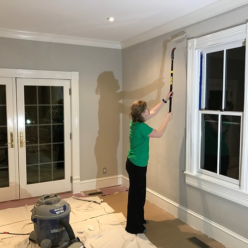
After what has seemed like an eternity of not making real progress on our house projects, lately we feel like we've really begun to hit our DIY stride again!
Back in our mid 20s, after we bought our row house, we felt unstoppable. We were getting projects knocked out left and right. We had few actual skills and almost no funds, but we felt like things were humming along. Looking back on these projects, they might not have been the most difficult on the DIY scale, but we felt empowered. Those memories give us a great deal of nostalgic fondness.
But as we've aged, quickly passing through our late 20s, the staggering blur of our early to mid 30s, and now finding ourselves nearing the pre-dawn of our 40s (or is it the sunset of our 30s?), our ability and knowledge in DIY renovation is far beyond what it was last decade. But with this knowledge and experience, it seems that our time to complete projects is stretching in duration exponentially in correlation with our advancing age. Let's go ahead and blame experience, attention to detail, professional obligations, and life rather then the inevitable reduction in energy associated with striving for the "over the hill" milestone.
Given all of these facts, making real and discernible progress anywhere just seems to feel oh so good! Dare I say, it almost feels like we're a couple of kids again...even if it seems we wake up with more mild aches and pains than we once did. I think this is one major reason why the quick office makeover felt like a huge burst of wind in our sails.
 Continue Reading Full Post
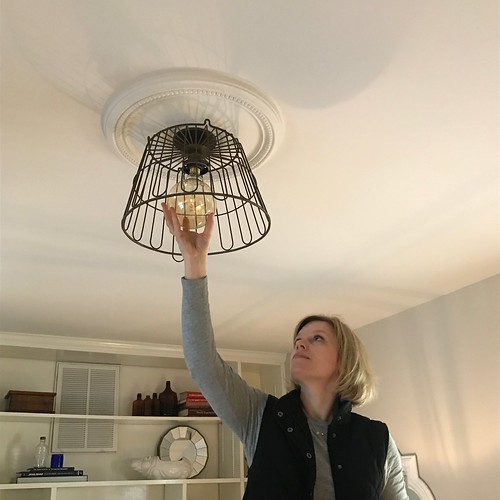
When it comes to light fixtures, they don't have to cost a small fortune to be visually interesting. In fact, with a little ingenuity you can make a low cost but very unique and stylish fixture of your own.
In our quick office makeover we had initially planned on keeping the ceiling fan that came with the house, even though we never really liked it. Though we had plans to spray paint it white to help it disappear into the ceiling, we realized just how much this room was missing a central ceiling light fixture with a little style.
After determining we didn't need fan in this room thanks to the installation of central A/C, a massive search begin for a new fixture that was reasonably priced, fit the casual style of our home, and importantly, was the right size. We held up fixtures I had already purchased for other rooms in the house, looked all over Northern Virginia including several HomeGoods stores, Lowes, Home Depot, and World Market, and scoured online.
Unfortunately though, we were striking out. Rather than spend a lot more time looking for that elusive unicorn of a fixture, we decided to go ahead and make one on our own.
 Continue Reading Full Post
Friday, February 24, 2017
There's really no better way to understand how a home's rooms flow from one to the next than by looking at a floor plan.
While we've been sharing the many recent projects we've been furiously working on at our "new" house, we've realized that the layout of our home may be quite confusing if you're reading along. In the past we put together a fairly detailed floor plan of our house in Old Town Alexandria, but we've yet to do the same for our house on the water.
So before we get further along in the descriptions of our work, how about we give you a little virtual tour of our space via a detailed floor plan, description, and a few photos?
From the outside our home is considered an American Foursquare, built at the very beginning of the style's popularity.
But on the interior it shares many holdover architectural details more commonly associated with late Victorian era construction. This is especially true when it comes to the home's more ornate mouldings.
 Continue Reading Full Post
![]()
![]()