It's minute detail difficult decision time in our bathroom.

Yes, it's true, in a project full of difficult decision after seemingly difficult decision, we've reached yet another biggie that involves one of our smallest (by size), but largest (by quantity) items.

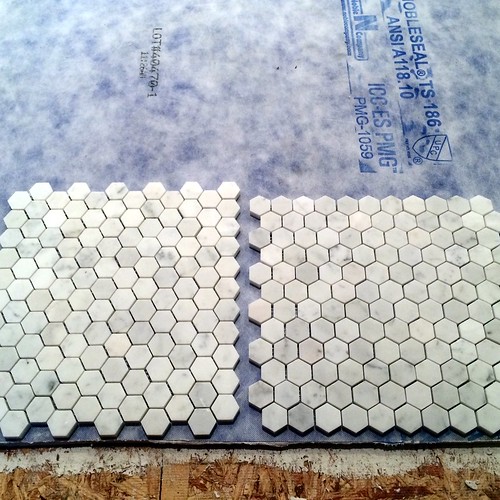
We're at that fateful stage of the project where we'll be laying sheets consisting of roughly 800 pounds of 17,000 one inch Carrara marble hexagon tiles, and we need to figure out which direction all of those tiles will face.

Wait, you didn't know there were directions in laying marble hex? Oh yes, and it's a super big deal! (At least in the realm of things that are big deals among other things that are not really dig deals.)

You see, the hexagon, with its hex number of sides, is no run of the mill quadrilateral with parallel sides and right angled corners (that's the PC way of saying square). Oh no sir-re-bob.

Instead, it's six sides are organized in a manner which has the shape sitting either on a flat side, or a pointed side, when rotated 90 degrees in any direction. And this is where our question comes in.

The Question

When standing in our bedroom and looking into the bathroom, should the hexagons be situated on the flat (left), or on the point (right)?

This, my friends, is the sort of thing that keeps me up at night. Similar to the questions of "How could Ronaldo be given an opportunity to bend the perfect cross into the box with extra time running out?" Although, with our question about layout of marble hex, we can control the outcome. And in the meantime, I'll just think about this goal instead of getting depressed about that late goal.

If you already know of this major decision point in a project, it's likely because you have had a similar exercise in decision making in your bathroom. If this is the case, I'd love to hear how you made your choice, and if you're happy with it.

And even if you've never been faced with this critical decision during your renovations, we'd love to hear your preference in the matter.

I won't say what orientation I'm partial to, but I will say that Wendy is open to suggestion on this topic. But our goal is simple. We want to class up the joint with our selection. What do you think? Which direction do you prefer when walking into the room? Are you with team on the flat, or are you pulling for team on the point?
Comments 58

Comments

Jason
6/23/2014 at 3:19 PM

I'd have to go with whatever gives you more of the points meeting up with walls that will eventually have moldings. It's a lot harder to cut the tiny segments to fill gaps on the points side than to cut half tiles to fill the flats side. I'm guessing that means flats towards the door, but I don't remember how your room is laid out.

Alex
6/25/2014

Ease of install, excellent point.

Diana
6/23/2014 at 3:19 PM

When laid flat, it makes me think of bees, when pointed, it makes me think of benzene, a petrol product. Personally, I prefer it pointed, the bees motif is a little too childish for such a classic bathroom. But, you know, it's for you to decide!Alt smile

Alex
6/25/2014

I hadn't thought of the bees until you said something, now that's all I see.

heatonmj
6/23/2014 at 3:23 PM

Pointed side up.

Laura
6/23/2014 at 3:25 PM

On the point. I have no idea why, I just like the look better.

Jenna
6/23/2014 at 3:34 PM

We installed 2 inch carrara hexagons in our bathroom several months ago before moving in. I woke up in a panic one night right before install when I realized we did not tell the contractor which way to position the tiles. What if one way just looked off and it haunted me forever? Rushed over the next morning and decided to go with the placement on the left with the flat sides along the doorway. It just looked a little more "right" in the space. The marble was more noticeable, whereas with the points at the door I noticed the cracks/grout more.

Allison
6/25/2014 at 4:55 PM

This happened to me. Although shown correctly in the drawings, I did not specify to the contractor which direction to run our herringbone tile pattern. He turned point to the left and oddly could not be convinced to rotate 90 degrees... It drives me nuts.

El
6/23/2014 at 3:48 PM

Point, seems more welcoming and leads you in kind of like an arrow.

Marly
6/24/2014 at 3:21 PM

I see the arrows too. The pointed suggests motion; the flat suggests stability. So, pick whichever mood you're going for.

Mike Howard
6/23/2014 at 4:05 PM
flat side parallel to door threshold. 1) there will be fewer and larger tile fragments to cut and stick;2) I think the pattern looks more integrated from a distance. Points to the door just looks like a load of horizontal rows. of course, once it's all down and you are standing in the room it won't matter which option you chose.
Alex
6/25/2014

Very true. Unless I could get the cuts at the door to end mid tile.

Kristin Saveland Buchanan
6/23/2014 at 4:25 PM
Point looks better, however Mike Howard is right, it's a lot trickier to install.
Mia
6/23/2014 at 4:32 PM

The points seem more interesting and have an energy or motion sense about them. But I guess the installer should have "right of way."

Alex
6/25/2014

I like this "right of way" idea. Maybe I could adopt it in more places than just this Alt wink

Kendi
6/23/2014 at 4:55 PM

I like the one on the right (on point). My first reaction was that it just looked better. As I stared at it more, it does seem like it's pointing/guiding you into the room. And the more I looked at it, the more movement it seemed to convey. Looking at any point, it feels like it draws you out radially in all directions. I know that radial motion shouldn't be dependent at all on the orientation, but that's the feeling I get when looking at the right one. After reading some of the comments, I do agree that the one on the left would emphasize the marble more and the one on the right would emphasize the pattern/shape. So if your intention is to try to look more like a seamless marble floor, then go with the one on the left. But if you want to show off the gorgeous pattern, go point. Personally I feel like if you have a cool shape/pattern, show it off! You wouldn't want a fancy herringbone patten blending together to look seamless either. My only hesitation is whether it would look weird having all those jagged points right at the door transition?? If you have a threshold piece that will cover it anyway, no worries. Otherwise, you probably will want to cut that first row down the middle so it starts out flat. Beautiful tile either way! So excited to see it once it's gone in!!Alt smileAlt smileAlt smile

Alex
6/25/2014

Thank you for the in depth analysis. Much appreciated. And I agree when your assessment.

Margie
6/23/2014 at 5:08 PM

The pointed side reminds me of chicken wire. I prefer the flat, but either will be beautiful.

Alex
6/25/2014

Hah! Forget the marble, we should have just used chick wire.

Amy Esmond Rutherford
6/23/2014 at 5:30 PM
Point.
Alex
6/25/2014

Taken.

DAF
6/23/2014 at 6:41 PM

Pointed. It may be more difficult on the door and window sides, but on the longer sides of the rooms it will put the flat edge up against the walls. Having said all that, I don't think that you can go wrong. Both look nice.

Ruth
6/23/2014 at 6:46 PM

I just had this same issue two years ago with these same or similar tiles but small hexagons. I opeted for flat ends because frankly it was easier to lay and to fill in. No i just sit and gaze at them as they are AWESOME!

Jenifer Ann
6/23/2014 at 7:00 PM
Flat all the way baby. But it depends. Flat is going to widen your bathroom... point will lengthen. What effect do you want in your bathroom? Deeper or wider? Generally, I feel like they are always pretty narrow, so I always vote for widening (thus, flat.) I think I confused myself.
Alex
6/25/2014

The room is pretty big overall, so I don't think we can really go wrong. Alt smile

Kelly Nelson
6/23/2014 at 8:05 PM
Point
Lisa
6/23/2014 at 8:16 PM

I vote flat. With flat I see rows of hexagons. The other way seems like hexagons running diagonally. Might just be me, though. Alt smile

6/23/2014 at 9:15 PM

I'm going to go with flat, and the reason is, it'll be easier to cut.

The next thing to remember, you won't be putting a full sheet up against that door, or likely along any wall as you will be starting from the center, if I recall right with straight chalk lines in both directions to work off of.

That way, when you get to a wall or in this case, the doorway, you'll be using a partial sheet with a flat edge against the door, so either way, it won't make much difference, at least to me, the main choice being, whether you want the points facing up/down, or sideways.

Either way, you'll not notice the seam, and may not even really notice the direction much since you'll be seeing it in both directions from wherever you sit/stand in said room anyway.

Monica
6/23/2014 at 9:29 PM

for some reason on point looks more old-fashioned and the flat orientation looks a bit more modern.
I'd do the flat. Once the whole field of tile's down and grout's in it might not matter so much. And less cutting means you'll be done and enjoying it sooner! Alt smile

Margaret Schleicher Bjorklund
6/23/2014 at 10:45 PM
Agree with Jennifer Ann.
6/23/2014 at 11:17 PM

Flat because it looks like if you laid it the other way (on the points) the pieces would be small and might be harder to cut.

Kerrie
6/24/2014 at 12:09 AM

Team flat - just like the look of it betterAlt smile

Pat
6/24/2014 at 1:08 AM

I had to go look, but I ended up on point. That's how American Restoration Tile laid out the border I designed and faxed to them. Good thing I'm a quilter because putting it together was a royal pain.

Melanie Allen
6/24/2014 at 8:05 AM
Left
threadbndr (Karla)
6/24/2014 at 9:18 AM

Flat. Points always look more 'public bathroom' to me. I think the flat will let more of the marble texture come through, while points will highlight the pattern of the tiles themselves.

Laura C
6/24/2014 at 9:31 AM

Team Point. For some reason, I "see" the hexagons more when they're oriented on the point, which I like.

KarinK
6/24/2014 at 10:05 AM

The only way to make a decision is to sit on the toilet and stare at both configurations, because lets face it: THAT'S when it is going to bother you the most if you make the wrong decision. And since we ladies spend all our bathroom visits sitting, we're going to notice it more. Since there's no toilet installed yet, take a stool in there and set it up in the right spot, and get to staring down at the "floor".

Tanja
6/24/2014 at 11:57 AM

Dang it. Now I won't be able to sleep. Alt wink
I'm on team point though. Prefer the straight grout lines when looking into the bathroom.

Btw I'd recommend to lay out and sort your tile sheets. Mixing them will give you a more cohesive look, since marble tiles may vary from box to box. Some might have more yellow toned ones while others are more gray or with more flecks.

Sherrie Beaumont
6/24/2014 at 1:06 PM

completely off the cuff - I like the one on the left. that is all.

cindy
6/24/2014 at 1:30 PM

LOve the suggestion to sit on the toilet and decide! Really - that is when it will bother/please you.

LD
6/24/2014 at 1:46 PM

Flat!!! Don't make yourself crazy with this too!!!

Emily
6/24/2014 at 1:52 PM

Flat

Dean
6/24/2014 at 1:57 PM

"...is no run of the mill tetragon ..."

My vote is flat!

amy
6/24/2014 at 2:49 PM

Team Point.

And another vote for sitting on the toilet to visualize the configurations better.

Judith
6/24/2014 at 3:03 PM

I like the right one. Looks more peaceful for some reason, the left one seems to be running in all directions at once and feels wrong to me.
I also pay more attention to the marble itself with the right pattern, since feels not as attention-seeking to me.

Taking the ease of cutting into account would be an argument, but I don't quite follow how the people saying cutting the flat one would be easier (at the entrance, I suppose?) are getting there. For the halves on the left version, you'd have to very precisely cut from a point to a point to make it look good, basically halving an angle. With the pointed version, for the halves you'd be cutting across the straight sections. Wouldn't that be easier to do?

Also, does it really matter, since you'll have to do both kind of cuts when going around the room anyway?

But as someone above said, the good thing, there really is no wrong choice here, it'll look great no matter what you do:)

Mia
6/24/2014 at 4:59 PM

The sitting on toilet spot is a good idea. And dry fit a much larger section in both styles, take pictures, and repost.

Barbara from the Feminine Pad
6/24/2014 at 5:01 PM

Pointed will make your butt look bigger.

Laura C
6/25/2014 at 11:03 AM

Perhaps, but flat will make your butt look flat. No one likes a flat butt.

Gaidig
6/24/2014 at 6:34 PM

I would base my decision on which way you think visually expands the room and orient the tile to expand the shorter dimension of the room. The at the door visual is not the only orientation you will be looking at! Also, depending on how out of square your room is, orient the points to the slanted wall, as it will be less glaring.

Erin
6/25/2014 at 6:04 AM

The layout on the right. It looks more natural to me.

6/25/2014 at 8:03 PM

I must vote on the point! Love the blog!

Tam
6/25/2014 at 9:14 PM

Flat/Left!

6/26/2014 at 3:11 AM

Oh, definitely on the point. I am not sure exactly why... It just seems right for meAlt smile And I think that this way it will be easier to install them.

Jean-Christian Pitre
6/26/2014 at 8:19 PM
I vote flat, but realistically, once it's installed and you've lived with it for a few months it's not something you'll really notice all that much. IS the grout going to be light or dark (this could make a bit more of a difference.
Cheryl
6/27/2014 at 3:32 PM

I don't think it will matter all that much - but you will probably want to have full tiles at the threshold rather than start in the center. It may mean that you are not square for the other 3 walls but the threshold is where you will most notice how straight the pattern is.

If you think the orientation will matter then dry fit both patterns across the full width of the threshold and look at it as you walk into the room.

And then dry fit several sheets near the toilet and pretend to sit on the toilet since that is probably the other time you will notice the floor pattern.

And as others have mentioned - if the grout blends then the pattern will be more subtle - if the grout is higher contrast then the pattern will be more noticeable (like the ungrouted sheets).

Kelly G
6/27/2014 at 5:21 PM

Whether you lay on point or flat you will still have the little points to cut. Right? If you don't cut them on the threshold you'll have to cut them on the right and left walls.

I did hex tile in my half bath a number of years ago and did it on point. I just liked the way it looked that way. I guess it's a matter of personal preference.

amy
6/28/2014 at 12:54 PM

can we have the source and other specs of the marble? want to get the hex too.

Danielle
7/3/2014 at 8:33 AM

I'm sad I missed the vote! I'm somewhat shocked at what a difference the 90 degree rotate makes - I kind of figured small tiles are small ties no matter how you slice them (unlike 24x8" tiles that would be much more obvious). I like them both ways, but for some reason my eye is drawn to flat. It just feels tidier to me. I'm excited to see the final install!

Since you've not signed in yet, you will need to fill in your name and email below. If you have a Facebook account, save yourself a step and use Connect to login.

Denotes a required field.

Please enter full URL, including http://

You can use Markdown syntax in your comment. And you can also use lots of Emoji!
  • Search

  • Login
  • Follow
  • Advertising

If you're looking for information on advertising and sponsorships, head on over to our sponsorships page. You can purchase site sponsorships in a few easy clicks. 

Toolbox Tuesday
Open Housing
  • We're Featured!

Old Town Home has been featured in the following places and publications:

The Washington Post
 
Washingtonian Magazine
 
Domino
 
Old House Journal
 
 
Apartment Therapy House Tour
 
Washington Post Express Feature
 
Home & Garden Blogs
 
© 2024 OldTownHome.com. - Privacy Policy
Login Below
or
Sign in with Facebook
Connect

Unexpected Error

Your submission caused an unexpected error. You can try your request again, but if you continue to experience problems, please contact the administrator.

Working...

Working...