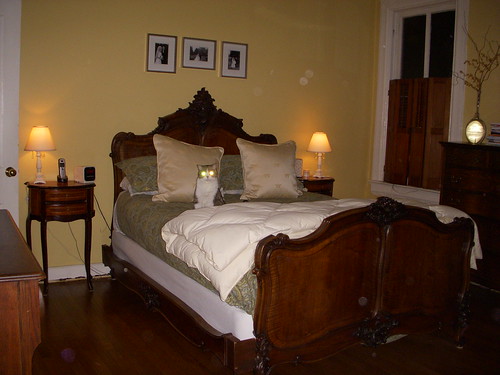
Over the last few weeks we've taken you through the various steps we took to bring our bedroom from drab to inviting. From the extensive efforts involving demolition and paint stripping, to the inclusion of a functional pull down attic ladder, our bedroom slowly transformed from a cold and unassuming space into a place we could comfortably sleep at night. But getting from this...

...to this...
...required much thought, deliberation, debate, and gnashing of teeth. In other words, it wasn't easy.
Though the renovation efforts in the bedroom itself were significant, the extensive work to turn a blank and functionless wall into the much needed closets of our dreams was the thing that truly altered the space, allowing it to evolve it into a warm, inviting, and proper master bedroom (and one where we could actually store clothes).
We had worked on the overall project for months, all the while sleeping in our guest bedroom that we lovingly called "the crappy B&B." As we wrapped up the closet build it was all we could do to resist the urge to clean out the construction items and throw all of our existing furniture back into the room. But I had bigger plans, and a lot of junk to sift through before we could create the calming space I had in mind.
With all of the moldings, casings, closets, and doors installed, we ran headlong into all of the difficult decisions that would serve to make or break the final appeal of the room. It didn't matter how smooth the walls and ceilings were, how well lit the space was from the new lighting, how perfectly matched and mitered the moldings were, or how nicely our clothes all fit in the closets. The big time decorating decisions were looming. I had been collecting various items along the way, and it was finally time for me to make some final decisions. Our blank palette was waiting.
The goal of the room was simple. I wanted a calming and serene sanctuary of a bedroom, much like you might see in a high end boutique hotel, but it had to be inviting and comfortable at the same time. To accomplish this I needed to start with an "inspiration piece." In the case of our bedroom, our inspiration came by way of a very early purchase in the project, our rug.
The antique rug had been purchased from eBay and brought a sense of warmth and comfort to the room. This massive 100 pound rug had sat patiently rolled up throughout our renovation waiting for us to finish the project so it could finally grace the room's floor.
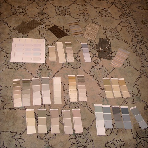
Prior to beginning the project, this rug played a most important role as the centerpiece for paint color and fabric selection throughout the room. Though this photo is not great, the flash gives a truer color representation of what we were working with and all of my various paint and fabric ideas.
I would occasionally unroll the rug just a bit so that I could lay down various fabric swatches and paint colors as a test. The advantage of working very slowly on many of our projects is that it allows a tremendous amount of additional time in the way of crafting a design scheme. As you can see, I was leaning heavily towards neutral and calming paint colors that would pull some of the more subtle tones from the rug. You can also see some of my early fabric leanings for the window treatments. These included several in the more teal/grayish-green palettes, almost all silk.
Using the rug's tones, I settled on window treatment fabric before selecting paint. I wanted to be sure the two major fabric elements in the room (the rug and curtains) could work together before I selected final paint colors. This was especially important since the paint color selection could actually help the two fabric elements work together.
The wide striped silk curtains I purchased online were by far the largest splurge in the room. The four panels were not inexpensive in the least and were a choice I truly agonized over. I loved the look and texture of the silk panels, and I simply fell in love with the style.
With the major fabric elements chosen it was finally time to move onto the paint color selections. I was certain I wanted a soft, muted color palette, and opted to go with a soft neutral on the walls. After living with the sunny yellow on the walls for a few years, I was done with bright colors in the bedroom. After much debate (and paint swatch analysis) ranging from beige tones to gray, I landed on Benjamin Moore's Balboa Mist in an eggshell finish.
I opted to pull in the soft, calming shade of blue from the rug as my ceiling paint. This was my first foray into a ceiling color other than white, and I was rather excited to try it. The ceiling is a subtle shade of Benjamin Moore paint called Silver Crest, and the interiors of our closets are also painted this color. This sea glass shade is a soft touch that you might not notice upon entering the room. You can see it peeking out from behind our storage tubs in this photo below.
One slightly funny note here. The paint store actually made a mistake in mixing the Silver Crest we used for the closet interior. The color they provided is actually far more blue than our ceiling. We didn't know until long after we painted the closet interiors since we painted the room's ceiling several weeks later. It all worked out in the end, but it will surely make paint matching a real pain in the closets.
We also gave our freshly stripped molding, new closet doors, door and window casings, and transom windows several smooth coats of our standard custom mix slightly off white Benjamin Moore paint in semi-gloss. There is a significant amount of molding and number of doors in this room, so we ended up using quite a bit of the white throughout.
The curtains weren't hanging in place for more than an hour before Mel was giving them his seal of approval.
The color and fabric selections in our master bedroom were such a critical element to helping me pull off the look I desired, and we had worked so hard to prepare the bedroom for what it could become. The work we had performed thus far was coming along quite nicely, but much like putting together an great outfit, we had we had selected the base of the outfit, the dress perhaps, but still needed to do a significant amount of work in selecting the various accessories that would truly put the room over the top.
What do you think of our various choices of color in our master bedroom? Do you think I was able to achieve the calming and serene backdrop to sleep I have been pursuing? The old yellow color in the room had me feeling a little on edge at all times, and my hope in using the gray and light blue neutrals with the greenish accents is that it will allow me to achieve this feeling of calm enjoyment whether I'm just waking up on a weekend morning or tucked in at night with a good book.

![]()
![]()