Today marks the nine year anniversary of the day Alex and I took ownership of our home, and thus embarked on this crazy journey of renovation adventures and misadventures. It's hard to believe that nearly a decade has passed since we were bright eyed and bushy tailed twenty-somethings, ready to take on the world...and take on the renovation of an ugly Victorian in desperate need of some TLC.
In honor of our house-iversary, we wanted to take a moment today to look back at where we started, and appreciate just how far we've come. It's been years of hard work, perseverance, challenges, and successes, but it's a journey we'd start all over again (at least I feel like that today, no telling what I might say on another day). We hope you'll come along with us for our look back at the good, the bad, and the ugly.
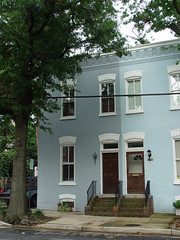
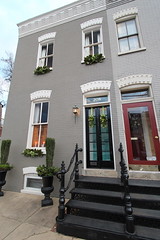
Let's start with a side-by-side of the exterior of our home. Our home certainly had potential. But with a new coat of paint, a new set of cast iron stairs for both our and our neighbor's homes, and our big vestibule reconfiguration project of 2011, we think we've made big strides as far as curb appeal goes. We're still sorry that we lost the big old tree out front, but have hopes that in a few years our new guy will do us proud.
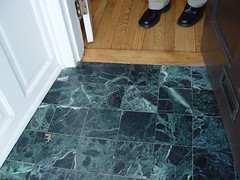
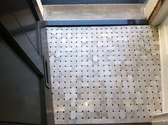
Moving on, let's take a look at the vestibule tile. What once greeted visitors was tired, dirty, and cracked green and black marble. We freshened up the look last year by installing a marble basket weave tile that picks up the black of our new french doors and cast iron stairs, as well as the warm neutrals of our interior paint scheme.
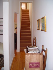
The old carpet on our staircase was NAS-TAY! Within only about 15 minutes of owning our home, we ripped that sucker off, exposing beautiful heart pine treads. WIth a harlequin paint treatment, salvaged leaded glass window, and custom wainscoting, we're thrilled with the new look of our entryway.

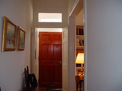
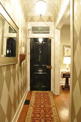
Here's another look at our downstairs hallway, this time looking toward the front door. We're so glad we reconfigured the vestibule in 2011 in order to flip flop the location of the solid front door and french doors. What we have now is historically accurate, functions better because the front door actually opens all the way, is more visually interesting and provides more depth from the outside.
Walking towards the front of the house this is a view of the living room and dining room, seen from our family room. The "double parlor" configuration had us stumped at first. But after living in our home for several years, we decided it would make more sense to have the formal living room and dining room at the front, rather than an awkward "double" living room without a comfortable configuration for television viewing.
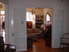
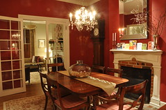
Standing in the entry hall looking into the living room once left you seriously underwhelmed. The original fireplace mantels were soot covered and discolored. We decided to paint them in the same off-white as the rest of the woodwork in our home for a more cohesive look.
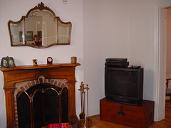
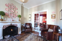
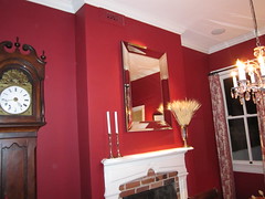
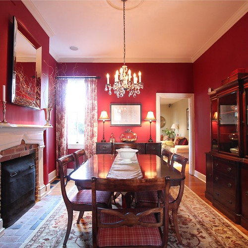
Seen here is a view of the mantel and window in our dining room. As you can see, the previous owner used the front two rooms as a true double parlor. We use them now as an adjacent living room and dining room. We completed a total renovation of the room, which included painting the mantel and ripping out that hideous air intake to make room for floor length curtains.
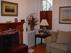
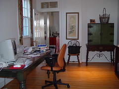
What the former owner used as an office is now our family room. Television viewing is something we like to do a lot here at Old Town Home. (Maybe that's why we're not finished renovating after nine years?) So a few years in, we changed this room from what we were using as a dining room to the present use as a family/television room. To be perfectly honest, it's also the room we eat most of our meals in.

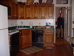
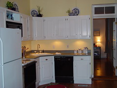
If you've been following our Inexpensive Kitchen Makeover Series, you'll know that we were less than thrilled with the kitchen we purchased back in 2003. The biggest challenge? Having just sunk our life savings into the down payment, we didn't have a surplus of cash to complete a "real" kitchen renovation. Painting the cabinets and using a textured spray paint to refinish the countertops made a huge improvement right off the bat.
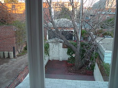
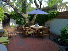
Take a peek at the backyard "before" and "now." Did anyone notice that I didn't say "after"? What we have now is a perfectly comfortable outdoor entertaining space -- but we have big plans several years down the road to rip out the uneven brick and shoddy beds to create something spectacular. Only time will tell on this project, but we hope you'll hang around to watch our progress on this one.
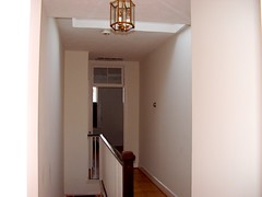
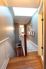
Our upstairs hallway was sterile and unappealing when we moved in. Plaster, paint, rugs, crown molding, a new light fixture, and some personal accessories make it a space we happily enjoy walking through on the way to our bedroom.
Speaking of our bedroom, I can hardly believe the photo I snapped during our home inspection (at left) is the same room that we lay our heads each night. The new closet space, complete with a hers shoe closet (thanks honey!), makes me just giddy. I'm sure we'll do a post or two on it at some point in the future. When we do I'll gladly show it all off.
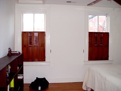

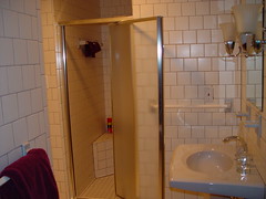
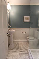
Our old guest bathroom would have made Blanche, Sophia, Dorothy and Rose feel at home. But this 1980s monstrosity had to go. What was once our guest bathroom is now both our guest bathroom and office (can anyone say wasted space?). Two things are for sure, we are using and loving every square inch of it and don't miss the old bath one bit.
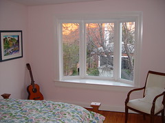
And finally we bring you to our guest bedroom, formerly known as "the crappy B&B." Alex and I lived in the back bedroom for a full year while renovating our bedroom, and it was gross. The walls were baby pink and cracked. We're not sure why it took us eight years to tackle this one, but last year's quick spruce up took us from crappy to happy in a couple short weekends. And we reused our old bathroom door as a headboard in the process. I'll call this a win.

So there you have it -- an abbreviated review of what we've been up to the last nine years. I guess you could say we've been busy, but we've been busy doing what we love. And even though we have a long way to go, I'd say we're well on our way to making our 15 foot wide Victorian a place we call home.
So what do you think? Are we on our way? Anything you love (or hate)? Any projects you see that you're dying to know more about? Any projects you're working on in your home? Just let us know.
If you're interested in more photos of our house through someone else's lens, check out our home tour on Apartment Therapy from last November.
![]()
![]()